Featured
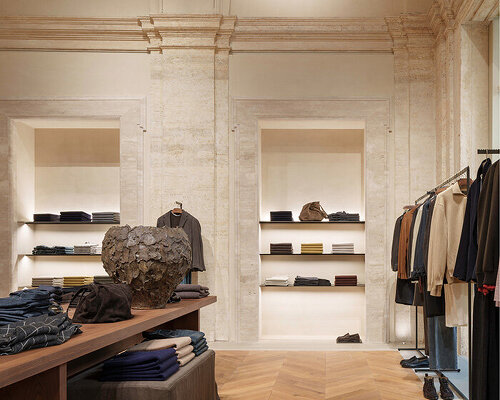
massimo dutti reincarnates 16th-century palace as rome flagship store
an olfactory archive, curated design books, and a custom coffee activation connect the fashion retail space to local culture.
designboom.com
Culture & More
Visual culture, tools, and the creative process
Design coverage tilts toward portfolio showcases and tool-launch announcements. The coverage that is actually useful to people who work in design or think seriously about visual culture takes more hunting.
Owl Post reads design with attention to where practice is actually changing. AI is reshuffling creative workflows faster than most design publications are acknowledging clearly. The gap between what design tools can do now and what most practitioners have integrated is widening in ways that are worth understanding. At the same time, the craft fundamentals of typography, layout, color, and visual communication have not changed, and the work of understanding them deeply remains as relevant as ever. Owl Post covers both: the tooling layer and the craft layer, and the honest conversation about how they interact.
The beat covers graphic and visual design, UX and product design (including the software tools and the professional practice), brand identity and the strategic decisions behind it, architecture and industrial design where the stories are significant, and the broader visual culture including illustration, photography, and the design of physical environments. Owl Post reads design publications with serious editorial standards, practitioner writing from working designers, and the technology press covering creative software.
Your digest adapts to how you engage with design. If you want the tooling-focused, what-is-worth-using framing that helps you evaluate what to add to your workflow, it reads that way. If you want the essayistic, culture-aware approach that treats design as a lens on how things get made and why they look the way they do, that register is available.
A daily design digest. Tools, craft, visual culture, and the conversations shaping where the field is going.
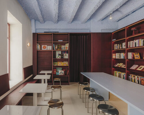
sahuquillodearriba renovates a 59-sqm space in el botànic neighborhood retaining elements of the building’s original character.

Promotion: the new Saxum collection from Italian tile brand Casalgrande Padana combines the natural look of stone with the practical qualities of porcelain. Saxum is described by Casalgrande Padana as putting "a modern spin on the primitive identity and sensual beauty of stone" and is available in five colourways. It features the imperfections, random veining,
Owl Post delivers a personalized design & creativity digest every morning, curated by AI, written in your voice.
Get your free digest